Before & After: A Bright & Energizing California Kitchen
We’re always inspired by creatives who can take a space from dark and drab to bright and exciting, seemingly with a magic wand. Orange County-based designer Ashley Fiocco did just that for one family in Southern California, whose former kitchen was outdated and out-of-sync with the rest of the home.
Ultimately, a few smart updates (and a lot of meticulous tile work) gave the space a fresh spin. What really completed the look? Our very own Roland hardware. As Ashley puts it, “The high quality of Schoolhouse pulls and knobs is evident in their substantial feel. They were the perfect finishing touch for this invigorating kitchen.”
Get the full scoop on the renovation below, along with a healthy dose of after photos captured by Olivia Katz.
Before:

After:

First, we’d love to hear about your background! What is your design philosophy?
I went to culinary school, then worked for several years with a celebrity chef. After I got married and had my two sons, I decided to pursue other long-held interests. I went back to school and, after becoming certified, founded Ashley Fiocco Designs.
I believe that living in a space you like is crucial to leading a flourishing life. And I think everyone should have a space that inspires and supports them, so I work with people who have a wide range of budgets. I often push clients past their comfort zones with respect to colors, patterns, and textures. So far, I’ve yet to have a client regret going further than they thought they could in a bolder-than-expected renovation.
I’m also concerned about the health of the earth, so I always aim to repurpose as many materials as possible and source as much as I can locally. The more we can reuse what’s already on site, the better!

Tell us about the kitchen. What were your first impressions?
The kitchen was renovated about 20 years ago by the previous owners, and after a decade in the house, my clients had had enough of someone else’s style. It was very dark and traditional, with finishes that were heavy and outdated.
Overall, the space did not offer the sort of boost the clients wanted in the morning when they came down to make their coffee. The window above the sink looks out over the back patio with birds of paradise, palms, and hills beyond, and I wanted to highlight that.
If you had to choose 3 themes that inspired the new design, what would they be?
Fun, energizing, and juicy!
My clients are empty-nesters who are (still) youthful and hip. They wanted to start their day in a bright and zesty space. They really enjoy mid-century design and wanted to incorporate that sort of aesthetic in the kitchen, which would bring it in line with the happy energy of the rest of the house.
What was the makeover process like? How long did it take?
The process took 30 days from move-out to move-in. Luckily, we didn’t have to deal with any (serious) surprises. Thanks to a great team, the job got done efficiently and painlessly!
Instead of Demo Day, we had Remo(val) Day. We cleaned and reassembled all of the upper cabinetry and donated it, along with the old sink and faucet, to our local Habitat for Humanity. Then, we kept the lower cabinetry boxes and upgraded to soft-close hardware, installing custom flat-front doors and floating upper shelves. The new doors and shelves were all made by a local carpenter. We kept the old appliances and used tiles that were handmade in the US for the confetti backsplash.
We also installed a new, energy-efficient picture window over the sink, maximizing the lovely views (especially the sunrise). The bespoke poured-concrete sink was also handmade in the US and provided organic texture — a bit of roughness amidst the glossy tiles and stainless-steel appliances. Now, we have a sunshiny vibe coming from both inside and outside the kitchen.


Could you walk us through your favorite update?
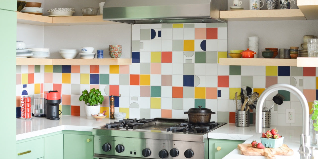
My clients and I agree that the kaleidoscope-like backsplash is our favorite part of the new kitchen. Before, the room was drab and uninspiring — nothing at all like the family who uses this space!
We created the backsplash with handmade Fireclay tiles, so each one is textured and slightly different. Each color we chose is vivid, lush, and citrusy. We laid out every tile on the floor and moved them around until we had exactly the layout we wanted. So even though it might look like the backsplash was assembled randomly, placing those 19 tile glazes actually took many hours of careful consideration.
We also lowered all the electrical outlets so the pattern of the backsplash would be uninterrupted at eye level. We kept neutral white tiles around the outlet covers, which integrated the outlets into the overall effect.

Finally, tell us about the Schoolhouse picks you chose for this space.
We chose the Roland pulls and knobs to complete this renovation. Their slight curve and the softness of their angles are a wonderful complement to all of the squares and the grid-like pattern of the backsplash. And with their natural brass finish, the hardware is a warm pop against the minty Behr Pesto Green lacquered cabinetry.