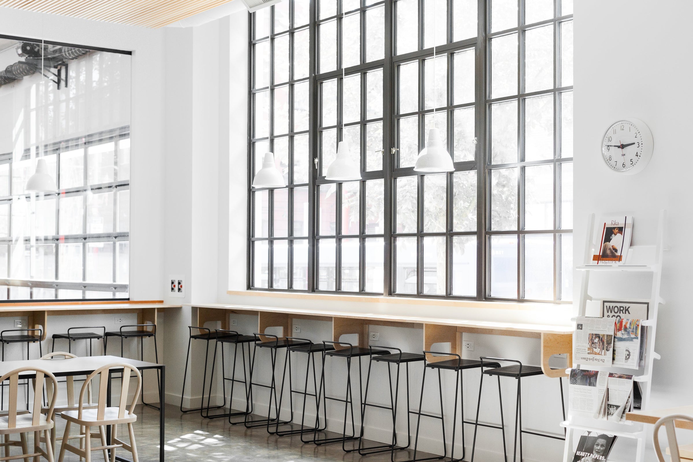
Inside the Design: Casey Keasler x Work & Co.

Casey Keasler, interior designer and longtime friend of Schoolhouse, is one of those creatives who seems like they can make something beautiful from anything they touch. In a career that’s spanned a decade at commercial architecture firms, a stint in product design, and time running visual storytelling for Mazama Wares, Casey has continuously demonstrated her multifaceted design acumen. Here at Schoolhouse, we’ve witnessed the power of Casey’s work for ourselves after this picture of a converted attic bathroom she designed became our most-liked Instagram photo ever.

For her own firm, Casework, Casey has taken on projects as diverse as the strikingly rustic Pioneertown Motel in Joshua Tree, California, and the modern-industrial-tinged flagship store for Tanner Goods in downtown Portland. After seeing the stunning, minimalist space Casey created with digital creative agency Work & Co. for their new headquarters, we caught up to talk to her about the project.

How did you get involved in this project and at point did you enter into the planning process?
"I went through an interview process. Work & Co approached me about my process once they finalized their now-current location. We got started with design about two months later."
How long did it take to complete the project?
"One year."
What ideas or notes did the team at Work & Co. come to the table with at the beginning?
"The partners were adamant about preserving the spirit of their current kitchen. It was a small space where the entire staff ate lunch together and took breaks, they didn't want to lose the internal community they had created, so a bigger space for this to happen with their growing staff was important. They also highly ranked the importance of sound control and light quality/control."
Work & Co. is known for being extremely design-driven in their work. Do you normally work with clients who are so fluent in the language of design or was this a unique experience?
"I work with a mix of creatives and professionals in other industries. Portland is a creative town, so everyone is creative in their own field, whether it's design or otherwise. It's definitely not a requirement to work with us!"
How would you describe the look and feel of the final space?
"A mix of Scandinavian and American styles. I like to think of the space as a backdrop to the digital product Work & Co produces; a place for creative eyes to rest but with enough interest to keep them inspired."


Do you approach designing residential and commercial spaces differently?
"Not really, the process is the same. First and foremost, we start with getting to know our client and the place we are designing."
What, if any, are the challenges of working with such a neutral color palette?
"Editing! The goal was to take a spare, minimal warehouse with 16-foot ceilings, concrete floors, and a very neutral palette then infuse just enough warmth and intimacy. I would edit then present, and Work & Co. partner, Casey Sheehan (yes, there were two Caseys on this project) would edit some more. We always start with a strong design intent and go back to it so the concept stays strong and we know we are on the right path. Being ok with saying no, this isn't the “perfect ____” for this space is sometimes hard on a timeline but we kept working until we were all satisfied."
What Schoolhouse products did you use in the space and how did you see them fitting into your overall design?
"We used the Factory Modern pendant, Shelby Mod Pendant, Beacon LED, and the appliance pull in black on a door in the kitchen. Schoolhouse bridges the gap of residential and commercial design. These fixtures feel just as good in the phone rooms and kitchen for an 18,000-square foot office space as they do over my own dining table. Yes, my dining table has a Schoolhouse pendant over it!"

Finally, what’s your favorite part about the final design?
"I have a few, but the kitchen is my favorite for a number of reasons. It was inspiring to be able to design an area for people to take a break from their work. So often, productivity and the bottom line are the main focus for a company. Dedicating this amount of space to taking a break is refreshing. I believe this space fosters creativity and community. Most of our good ideas come when we aren't at our desk, the desk is all about making the ideas happen but we also need a space for ideas to develop."
Photography by Ellie Lillstrom

