A 1920's Georgian Home Remodel in Portland

Those who follow our blog or Instagram have almost certainly seen some of Max Humphrey’s incredible interior design work, like this office he made for Union Wine or this client’s living room. Recently, Max wrapped up work on a 1920s-era Georgian home in Northwest Portland. In his inimitable style, Max filled the space with a rich array of vintage and contemporary furniture set against a color palette that elevates all of the original architectural features of the home.
We caught up with Max to ask about the challenges and opportunities of designing within an older, more traditional home. Make sure to read to the end, where he kindly provides his top five interior decorating tips.

When did you get started with this project and what goals did the homeowners have for the home?
"The clients got in touch with me around this time last year after they had just bought their house and asked if I could help with some furniture and with a ‘light cosmetic remodel’ which turned out to be not so light."
What elements did you like about the space and what things felt like they needed an update?
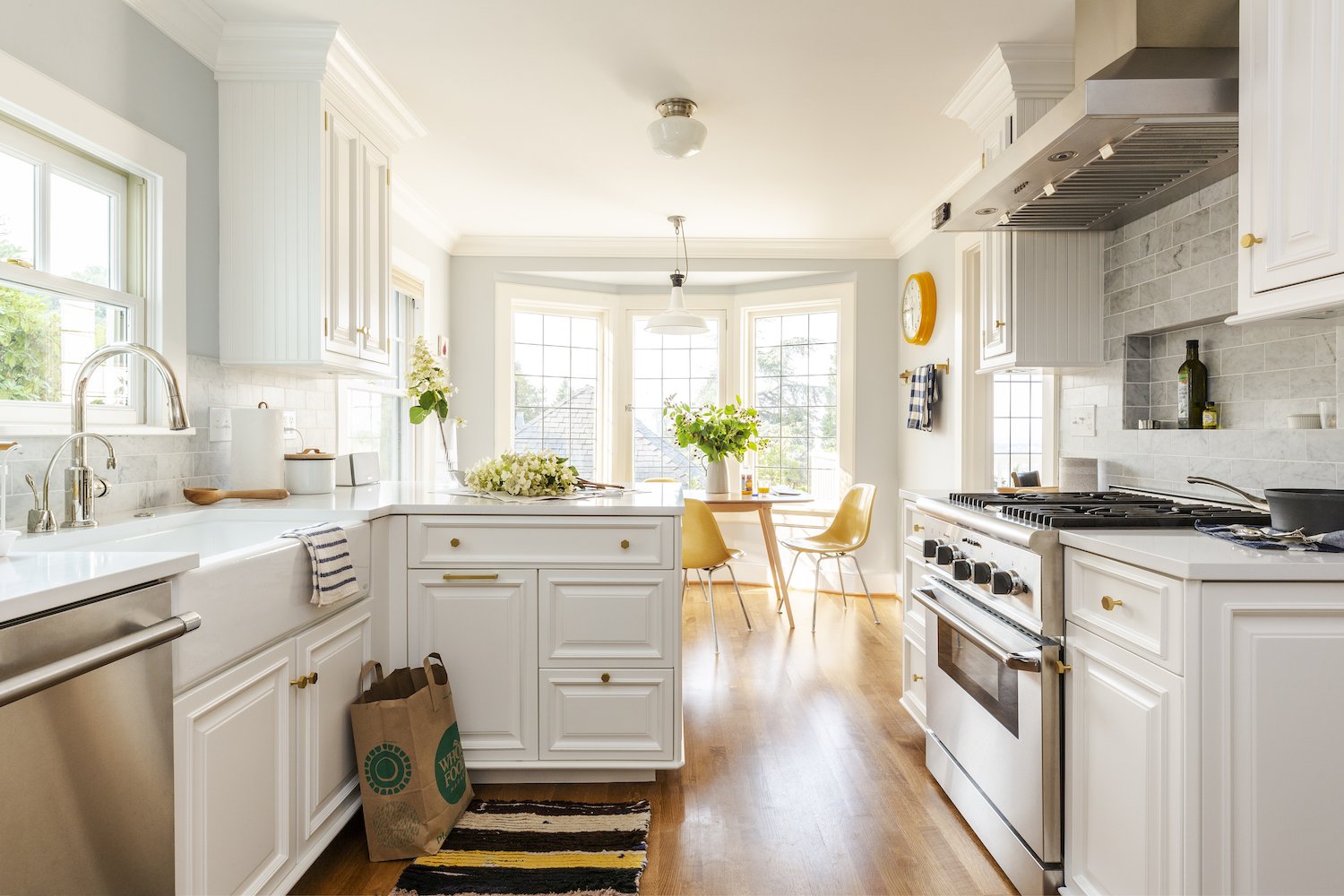
"The house was built in 1927 in a sort of Georgian style and retained a lot of cool, original architectural details that you wouldn’t see in a newer home. It had gone through a remodel or two or three in the past but nothing was beyond fixing and luckily none of the previous owners did anything awful like add a million ceiling cans or anything. It needed paint inside and out and the kitchen needed an overhaul. There were other updates too like flooring in some rooms, a new fireplace situation, and then less glamorous stuff like attic insulation and other boring, expensive things old home sometimes need."
How did you approach the color palette, textures, and materials used in each room?
"I just kind of wing it with that stuff. I tend to stick with blues and greens and black and white and gray anyway and then bring in color and texture with things like art and accessories. If I overthink palette or try and come up with a cohesive design on paper it never works out."
Do you find it more fun to work from a place that has strong features (like crown molding, hardwoods, and bay windows) or one that is more of a blank slate?
"I like working on old homes that haven’t been ruined yet. The things architects and builders would do in older houses are almost always cost prohibitive now. Too much of a blank slate freaks me out and there’s too many bad, new/modern homes cheaply built around Portland anyway."

What are some of your favorite pieces you brought into the space?
"The clients owned some vintage stuff already so it was fun mixing their heritage pieces with more contemporary items. They also have a batch of art which was fun to mix and match around the house. Modern art looks super dope in old homes. There’s some vintage rugs from Kat and Maouche that help soften the space and I love supporting local businesses."
Can you name some your favorite simple updates or additions to a room that make the biggest impact?
"We were able to do some significant changes in the kitchen but simply swapping out your cabinet hardware is a good way to freshen up even a rental house or apartment. And then you can switch back when you leave and take your hardware with you."
You’ve been updating your own home quite a bit this past year. What was most important for you to accomplish design-wise in your own home?
"I’m a middle child and the middle child is nobody’s favorite so I like having things that no one else can have. Almost all my furniture I designed and had built by a local furniture maker named Nathan Dinihanian. And I’m constantly collecting vintage one-of-a-kind pieces. It’s important that my house doesn’t look like anything I’ve done before and I’m a pretty good client because I listen to everything I say."
It’s clear from your hilarious Instagram that you don’t need to take design too seriously to be great at it. What are your top five Max-Humphrey-approved tips for fun and functional living spaces?
"1. More everything, all the time. 2. Don’t push all your living room furniture against the walls - if you ‘float’ your sofa and chairs in the middle of the room it creates flow and makes your space look bigger. 3. Books are the best design accessory and you can never have too many. 4. Don’t be too precious about hanging art (or too precious about anything). 5. Never play cards with a guy who has the same first name as a city. If you stick with all that everything else is cream cheese."


Photography by Christopher Dibble

