A Clean & Classic Abode With Just a Touch of Quirk
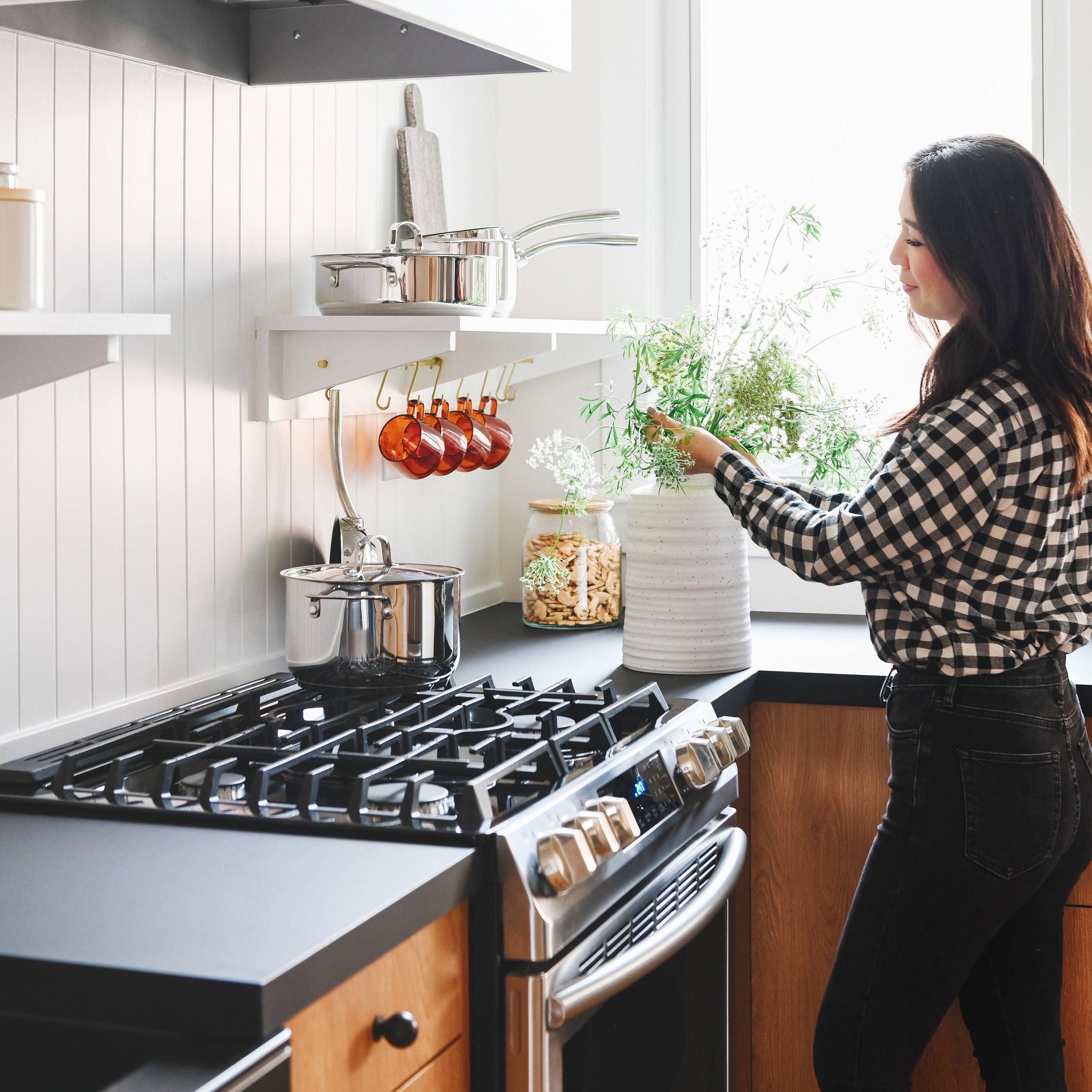
2023 is an extra special year for us because it marks two decades of doing what we love most—making modern heirlooms the old fashioned way. As we celebrate 20 years of Schoolhouse, a lot of feelings come to mind, but at the top of our list is gratitude—for our story, growth, and the continued support from our community near and far. We’re honored to be a part of so many beautiful & inspiring homes, and we could think of no better way to commemorate our anniversary than by sharing a few of our favorite spaces.
We asked longtime Schoolhouse friend, Kim Vargo (the creator behind @yellowbrickhome) to share what timeless design means to her and show us how she's styled her Schoolhouse pieces over the years.
What was your first Schoolhouse product and why were you drawn to it?
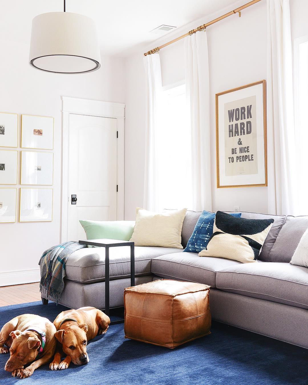
Our first Schoolhouse product was the print by Anthony Burrill, Work Hard & Be Nice to People. I admired ever since I saw it Kirsten Nieman’s home, and I saved up to buy a signed original from Schoolhouse! This was over a decade ago, and I had it framed in a gilded gold frame. It resonated with me in a way that I felt in every part of my being. I still love it to this day!
Kim's Home in 2016:

How would you describe your interior style in three words or less?
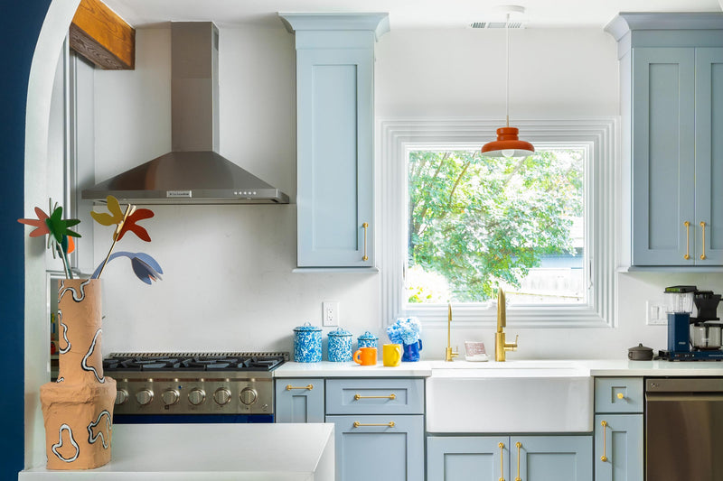
Classic, clean, and with a touch of quirk (always).
Could you share a little more on the journey to finding your personal style?
We’ve experimented with different styles over the last 20 years to find ourselves where we are now. We’ve tried everything from pumpkin-colored walls to painting furniture to turquoise to big, bold wallpaper. We like to joke that a lot of these questionable decisions were ‘getting it out of our system,’ ha! In the end – and several home renovations later – we’ve realized that the most important aspect of our design style is to let the bones and the age of the home dictate where we go. Most of the homes we’ve renovated were built in the late 1800s, and we take that into account.


Would you say your design style has changed over the years?
Absolutely, yes! I’m so glad we’ve taken the time to experiment and explore. Scott and I have had 20 years to find our ‘sweet spot,’ a blend of form, function, and the unexpected.


How do you see Schoolhouse products fitting into your home as it evolves and shifts?
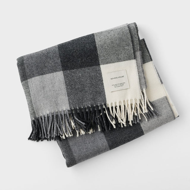
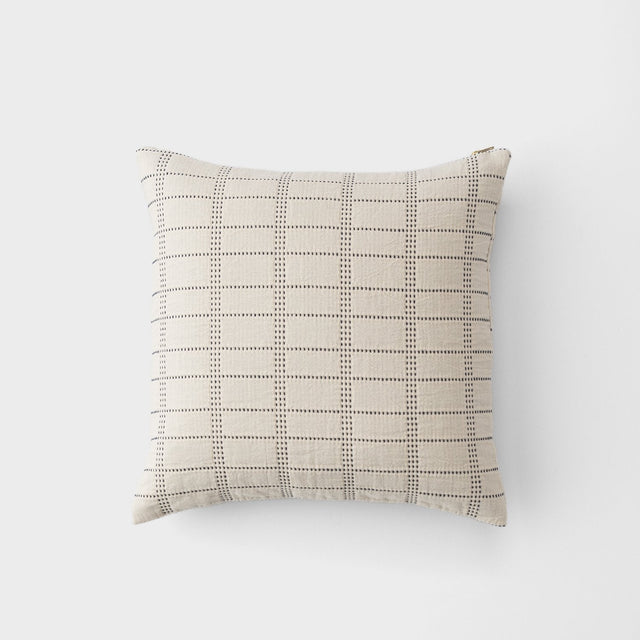
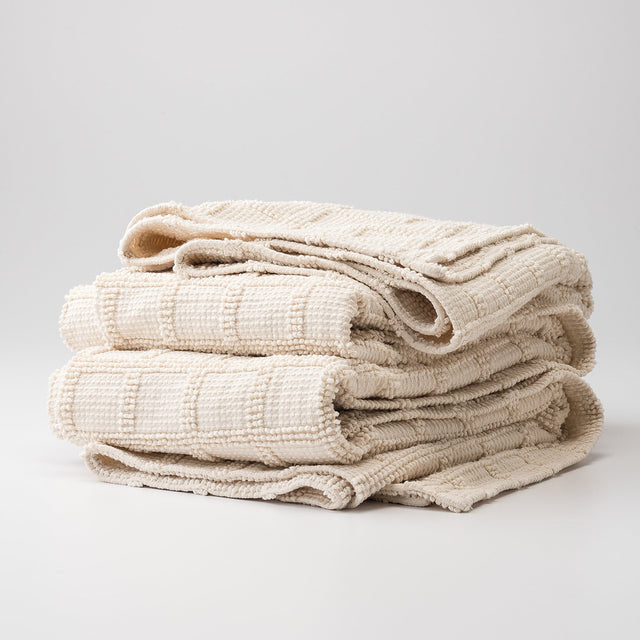
Schoolhouse products are timeless with a level of quality that makes them instant heirlooms. From lighting to textiles, to furniture and artwork, we know we can count on Schoolhouse to add that something special to any room we design.


Last but not least, we have to ask. Do you have any all-time Schoolhouse favorites?
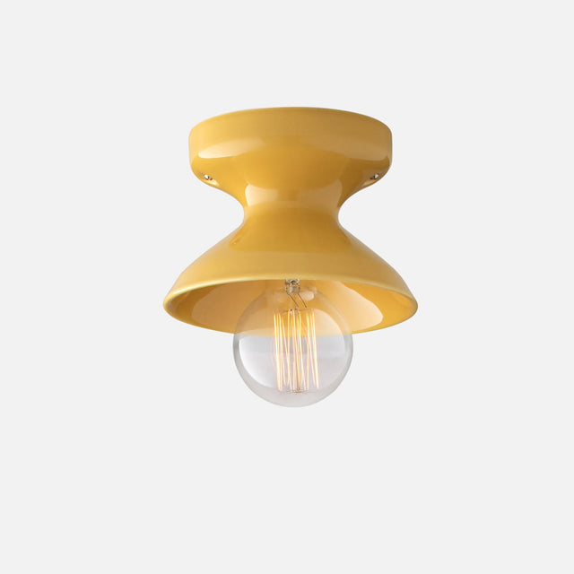
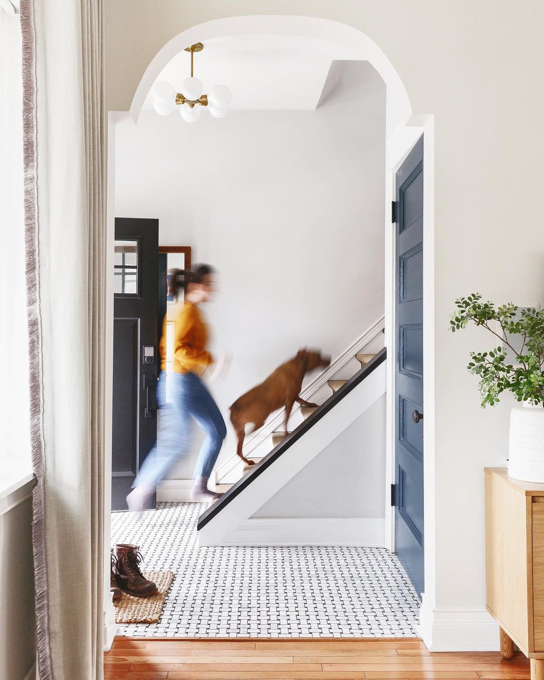
We have a soft spot in our hearts for the Alabax light fixture! With three sizes and several colors to choose from, we adore the flexibility it provides for hallways, bedrooms, accents and special moments. We’ve used a bright yellow Alabax over a sink, black in an entryway, and soon, we’ll install two auburn Alabaxes in a small-but-mighty hallway!

