Home Tour: Anne Sage's Serene Los Angeles Home

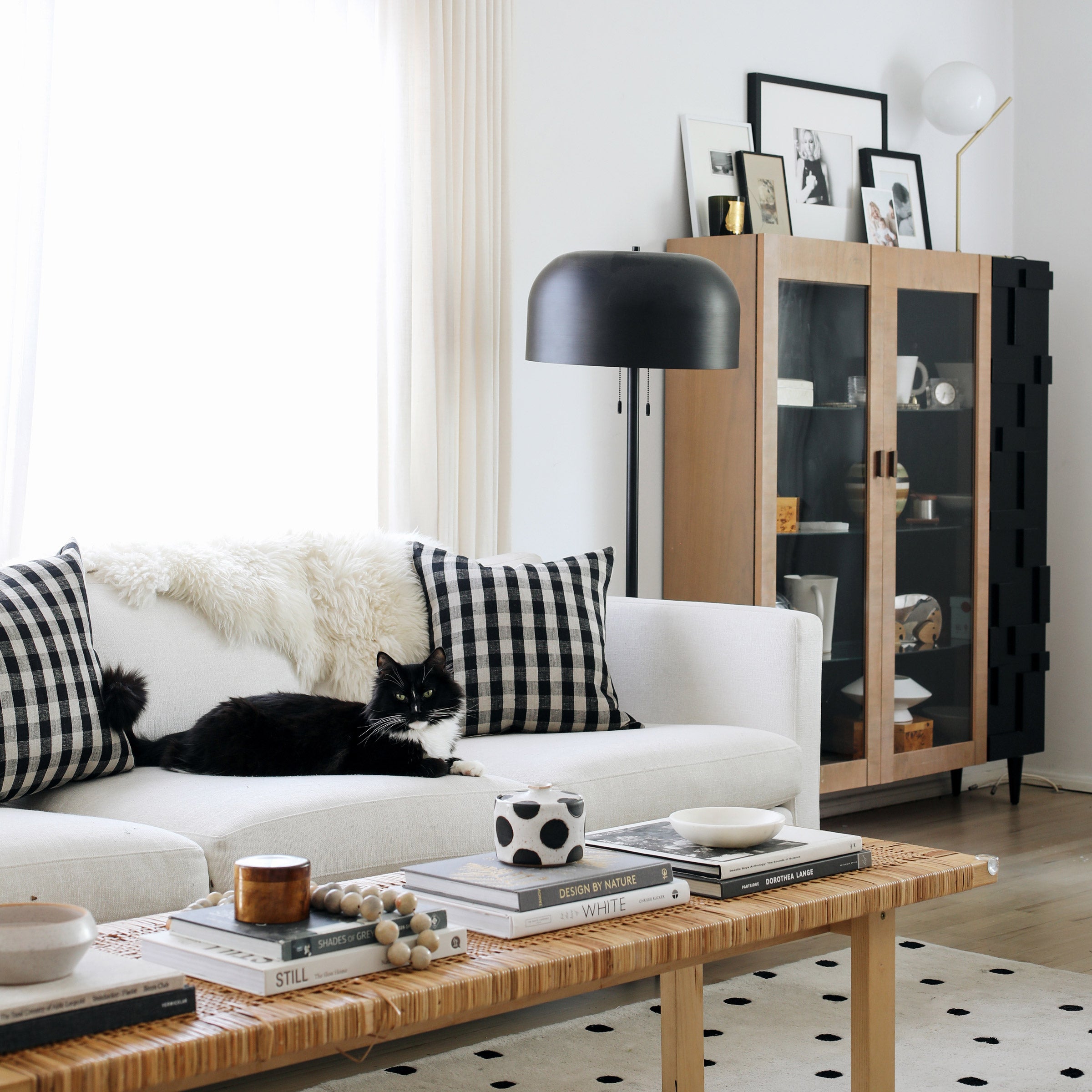
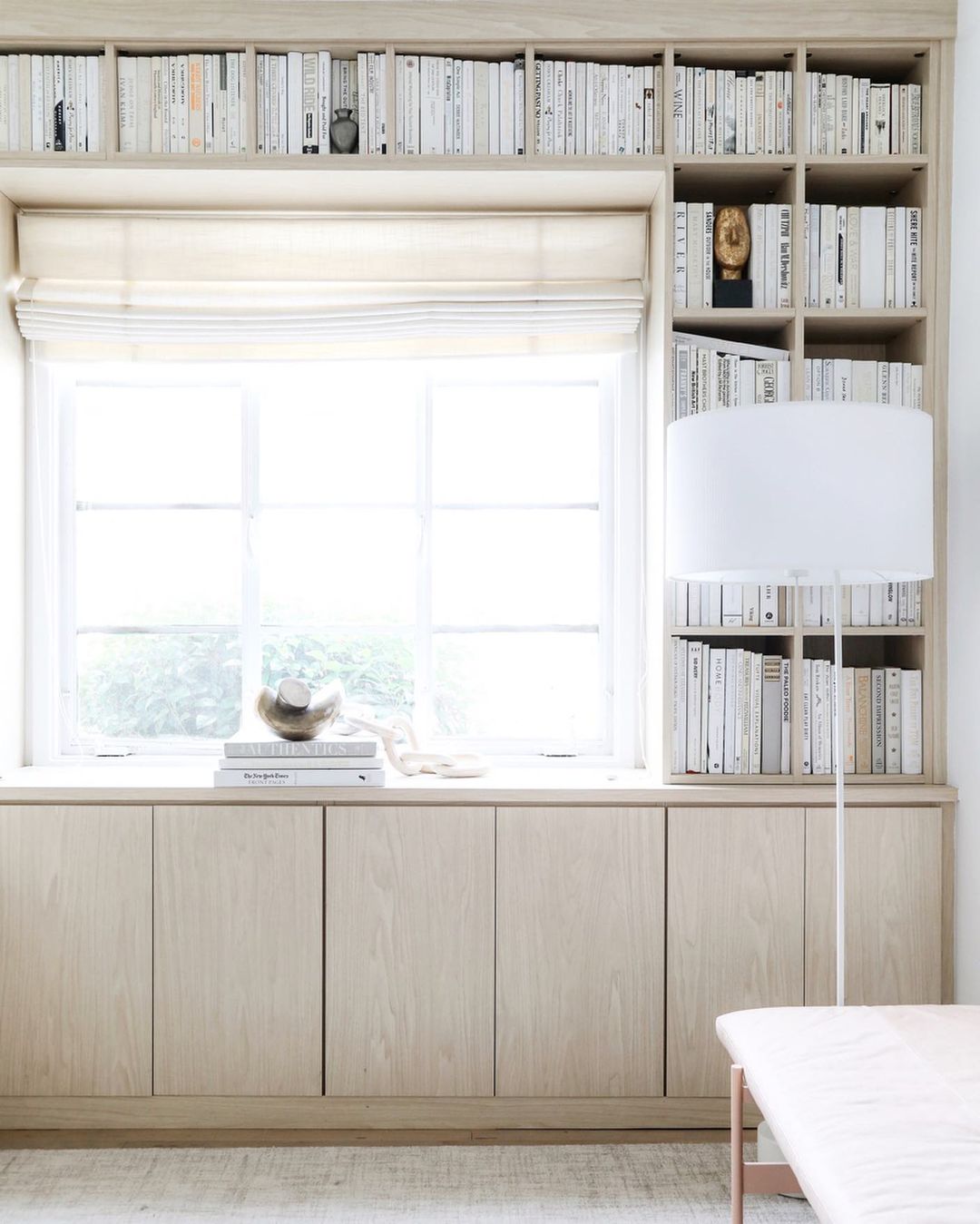
Here at Schoolhouse, we’ve long looked up to interior designer and creative Anne Sage for her exceptional ability to create intimate settings that are inherently calming. Filled with cozy textures and neutral hues, Anne’s serene Los Angeles bungalow strikes the perfect balance between luxe and lived-in while proving that you can still achieve the home of your dreams no matter the square footage. Inspired by her story and style, we spent some time with Anne to hear more about her creative process, motherhood journey, and early interior beginnings.
Tell us about your home! How long have you lived there, and how did you find it?
Our home is a little 1954 bungalow located in the Atwater Village of Los Angeles. My best friend actually found it for us when we were looking for an upgrade on the little granny flat we’d been living in. She happened to see a "For Rent" sign in the yard when she was driving by, and we jumped on it! It’s just a rental, but we’ve enjoyed the benefit of a lovely and hands-off landlord who’s let us do things like refinish the floors and renovate the kitchen to our taste.

Could you share a little bit about your background? Have you always been passionate about interiors?
My mom and both my grandmothers were seriously into design, and I grew up helping them with projects like wallpapering and sewing curtains. I can still remember trips to the Laura Ashley store in the ’80s and the chintz/stripe/pin-dot combo we chose for my childhood bedroom!
As far as my career path, after getting a degree in English at Stanford, I wound up in New York working as a consumer strategist at an ad agency. My dream, though, was to work at a design magazine. When I couldn’t get a foot in the door anywhere, I started my blog.


Starting a blog helped me hone my eye for design and build relationships — not only with brands that I respect and admire — but also with fellow design enthusiasts. Thirteen years later, I’ve co-founded an online lifestyle magazine, written an interiors book, grown an engaged Instagram following, and built a small but steady design client practice.
In five words, how would you describe your aesthetic?
Textural, organic, clean, and quietly playful.
Do you have a favorite room you like to spend time in?
Our kitchen is definitely my happy place! It’s not huge, but it’s thoughtfully laid out for a perfect marriage of form and function. I love shuffling into the kitchen first thing in the morning to make coffee and seeing the way the early light bounces off the surfaces. Plus, the small open shelf is a dream to style; I love swapping out my favorite knickknacks depending on my mood!
Your daughter, Halo is adorable! Has becoming a parent been everything you thought it would be in terms of expectation vs. reality? Any insights to share around your motherhood journey?
Becoming a mom has been such a grand and joyful adventure! Like any of life’s big transitions, it doesn’t seem to matter what your expectations are because the reality is always bigger, bolder, and more REAL than you can prepare yourself for. People tell you that it’s hard, but you can’t appreciate how hard ‘til you’re in it. People tell you that your love for your child will be huge, but "huge" doesn’t do justice to the scale of that love once you’re living it. So, I guess the best insight I can offer is: abandon all your expectations because they’re going to be blown out of the water anyway!
How do you balance function and form when designing for your family? Has your approach changed since becoming a parent?
Clutter can so easily veer into chaos when there are little ones in the home! We tried to limit how much "stuff" we acquired for Halo when she was born, and even then, we found that we didn’t use half of what we did buy.
"I’ve always espoused a less-is-more approach when it comes to design, and that refrain has only grown louder for me since becoming a mom."
There’s also a certain degree of compromise and surrender that comes with designing for families. For example, I’ve chosen to have a light-colored rug under our dining table. I love the look of it, and I do my best to keep it clean. But I’ve also come to accept that I’ve struck a devil’s bargain involving impenetrable avocado stains on my vintage hand knot (insert quiet sobs of despair here).


What are your top five Schoolhouse items and why?
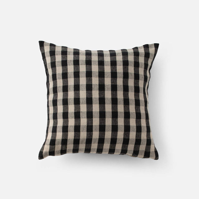
Can I get a huge round of applause for the Linen Check Pillows? I have these on my sofa and recently used them in a client design for a young boy’s room. They strike just the right balance between fun and sophisticated, modern and classic. The black and ecru check complements warm and cool palettes, and they add a zesty punch of pattern without feeling too wild - they're the hardest working pillows on the planet.
I’ve also always had a soft spot for the Oak + Leather Towel Holder and Tissue Holder. I feel like I’ve seen a thousand imitations over the years since these first came out, but nothing can beat the original! They’re a simple and impactful way to add a touch of warmth and organicism to even the smallest bathroom. I get really happy when uber-functional pieces —those items we all use every day — can be used to pack a major personality punch!
The Beacon LED Sconce is another do-all in any situation. It looks fantastic mounted both on the wall and the ceiling, and it’s got a utilitarian vibe that’s stylish but still subtle enough not to detract from other more prominent design elements. We’ve got one in the breakfast nook of our kitchen, but it's great to use when you need multiples too. I recently completed a client project for which we used one in a vestibule and then several more straight down the home’s central hallway.
The Popcorn Grid Coverlet reminds me of a bedspread my grandma used to have, and I mean that in the best possible way. There’s a nostalgia to it that feels cozy and inviting, like a warm glass of milk and a plate of Fig Newtons enjoyed with a good book under the covers. At the same time, the craftsmanship on it is stunning. What a gorgeous way to add texture and pattern to a bedroom!
We have several Eduard Sconces in our kitchen, and I get asked about them constantly! It’s not always easy to find fixtures that fit into small spaces, so I really appreciate that they’re petite in scale at 7.5” high. I’m able to have them over my open shelving and can also place items under them on the shelf! The brass finish has acquired a cozy patina over the years, making them look even better than the day they were installed.
How has the meaning of home changed for you this past year?
I’ve always been a homebody, an introvert who’d rather stay in than go out. Creating a home where I feel grounded and safe has always been one of my intentions with interior design. So, in the past year, that sense of safety at home has only become heightened, and I’ve acquired an ever greater sense of gratitude for our little corner of the world. We certainly had our moments of feeling like we were climbing the walls, but overall, I’ve been so impressed at how adaptable our 800 square feet have proven to be!
Finally, what’s something you're looking forward to this year?
Well, I’d say our biggest upcoming event is that we’re moving! My parents recently took over my grandparents’ home in Reno, which has been vacant since my grandpa passed away in March 2020. It’s a gorgeous 1960’s ranch-style house that has good old bones but needs some serious TLC. So, we’re relocating up there to take on the project! I’d be lying if I said I wasn’t overwhelmed by the scope of the work it needs, but it will be so rewarding to bring our family home into the 21st century while still maintaining the sense of history and character it has acquired over the years. Stay tuned!


Photos courtesy of Anne Sage


