Schoolhouse Spaces: Mt Tam Pediatric Dentistry

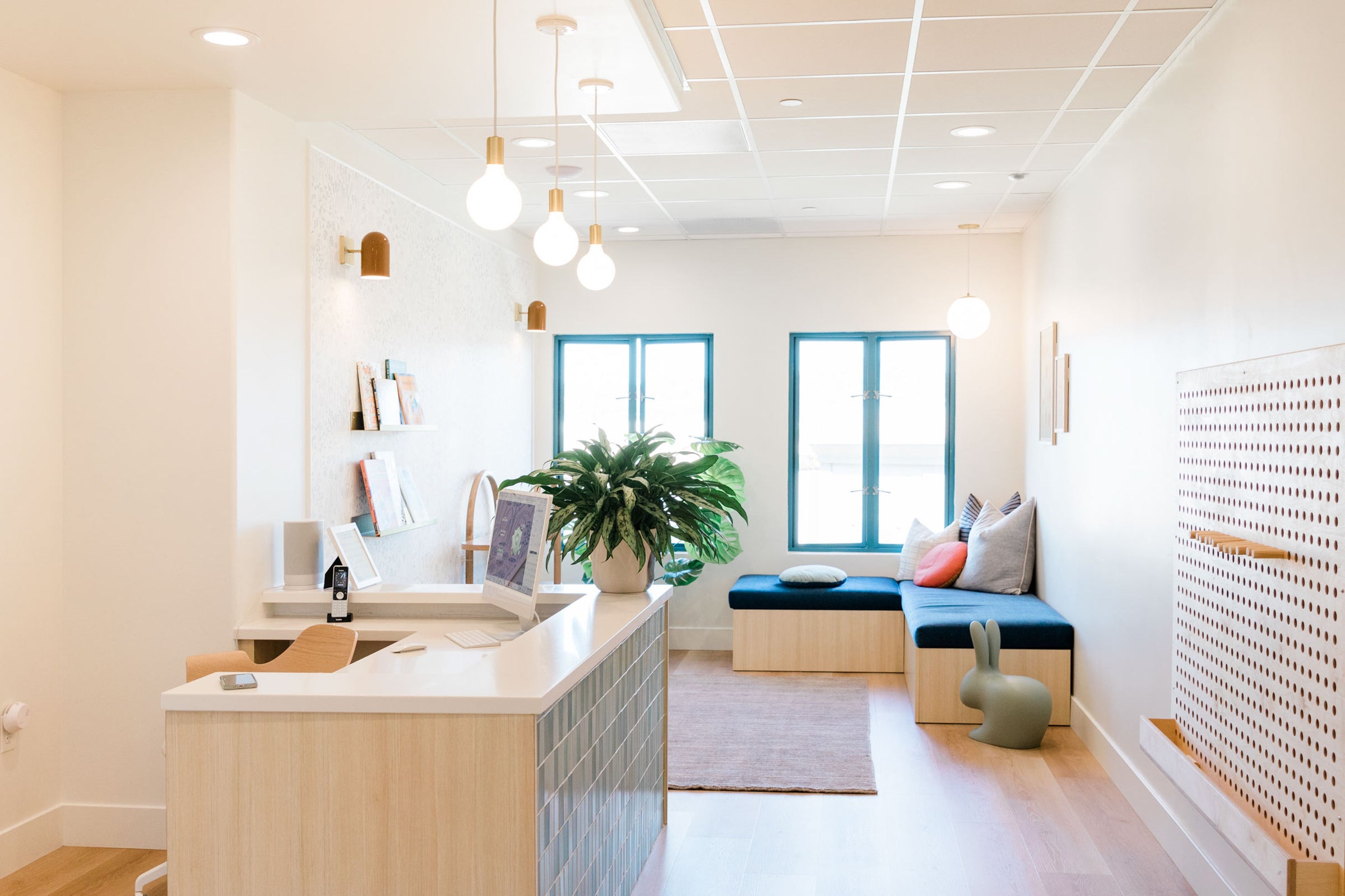
A place to dream, learn, and do kid's dentistry, differently — that was the vision behind Mt Tam, a pediatric dental office in the heart of Corte Madera, California. Our latest Schoolhouse Spaces highlight, Dr. Stephanie Hardwick and her team, have transformed a commercial breezeway into a playful and imaginative space for all ages. From the lighting to the layout, every design detail has been thoughtfully selected to encourage interaction and a love for learning. Inspired by her story and success, we asked Dr. Hardwick to take us through the vision and values behind her practice and some of the design highlights of the space.

Tell us about Mt Tam. What was the vision for your practice?
Working with young children in a field that can be intimidating for kids and adults, we wanted to create an environment that was calming and comfortable for the whole family. We knew if we could make children feel at ease physically, their emotions would follow. We understand the power of design and the impact it has on experience, so getting our aesthetic right was crucial.
As a busy mom with two young kids, convenience was essential as well. We set up mobile-friendly systems that would be simple for parents to use. That way, when appointment day arrives, parents are able to maintain a positive focus on their kiddos (instead of worrying about paperwork and other logistics).

Could you share a bit about your background and how you landed in the healthcare industry?
There are so many experiences from my past that contributed to my journey. Growing up, I was drawn to both interior design and teaching. As a teenager, I taught swim lessons during the summer. I found it extremely rewarding to help children learn an important life skill through play.
When I got to college, I had to choose between a career in event planning or healthcare. Ultimately, I picked dentistry. About halfway through dental school, I decided to become a pediatric dentist. It was such an obvious fit for me, and I can’t imagine being in any other specialty. I love my job, and although working with young kids can be tough at times, the rewards far outweigh the challenges.
"Children learn through play. I love helping build their confidence in a fun and approachable way."


What was the creative inspiration behind the space?
I was inspired by the simple sweetness of my son's Waldorf preschool. Watching the children navigate the classroom so comfortably with natural curiosity (without becoming over stimulated) was exactly what I wanted for Mt Tam. It needed to be fun, without being too fun, and child-friendly without being obnoxious or tacky.
I wanted to instill a sense of calm, but still provide enough for kids to interact with, enjoy, and look forward to. We also needed to consider our patient pool at large. We see children from infancy through the teenage years, so appealing to all age groups (including parents) was important. We selected pieces that allow our space to remain clean, fresh, timeless and approachable for all.


What were some of the highlights and/or challenges of the project? Any fun facts or unique things to consider when designing a pediatric dental office?
We took over an old dental office because we thought it would simplify things. We were so wrong! When we assessed our priorities, we realized we had to gut the place and start from scratch.
The space presented some design challenges, and Schoolhouse’s in-house design services were incredibly helpful. My designer, Jess, listened to my goals and budget while walking me through the selections. She provided a perfect amount of hand-holding, asked questions that helped me stay focused on my goals, and came up with unique solutions when we ran into roadblocks. Jess also understood my design needs and limitations and approached the project with flexibility and an open mind.

Could you walk us through a few of the Schoolhouse products selected and why you chose them for the space?
I went with the brass Luna Pendants in front of the window to create a warm and welcoming corner without obstructing the Mt Tam view. I also selected the Alphabet Print by Amanda Jane Jones. I love that it is child appropriate without feeling too juvenile. Another favorite is the set of Mollie Hooks in our entry, which provided the perfect place for people to hang their things when entering, especially during the cold and rainy season.

Finally, what’s your favorite part of the final design?
I have a lot of favorites, but the Hygge & West + Schoolhouse Alpine Garden Wallpaper tops the list. We had a large plain wall, so we "framed" the floral print wallpaper with trim and hung two Allegheny Sconces in Butterscotch and a pair of brass Brake Angle Picture Ledges. I love it and so do the Tam families!


Photography by Sophia Studio


