Schoolhouse Spaces: The Dean Apartments
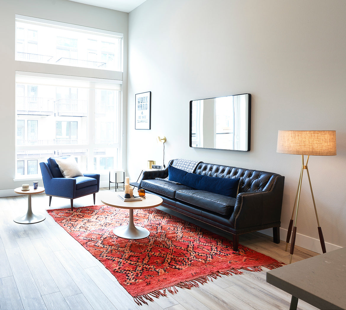
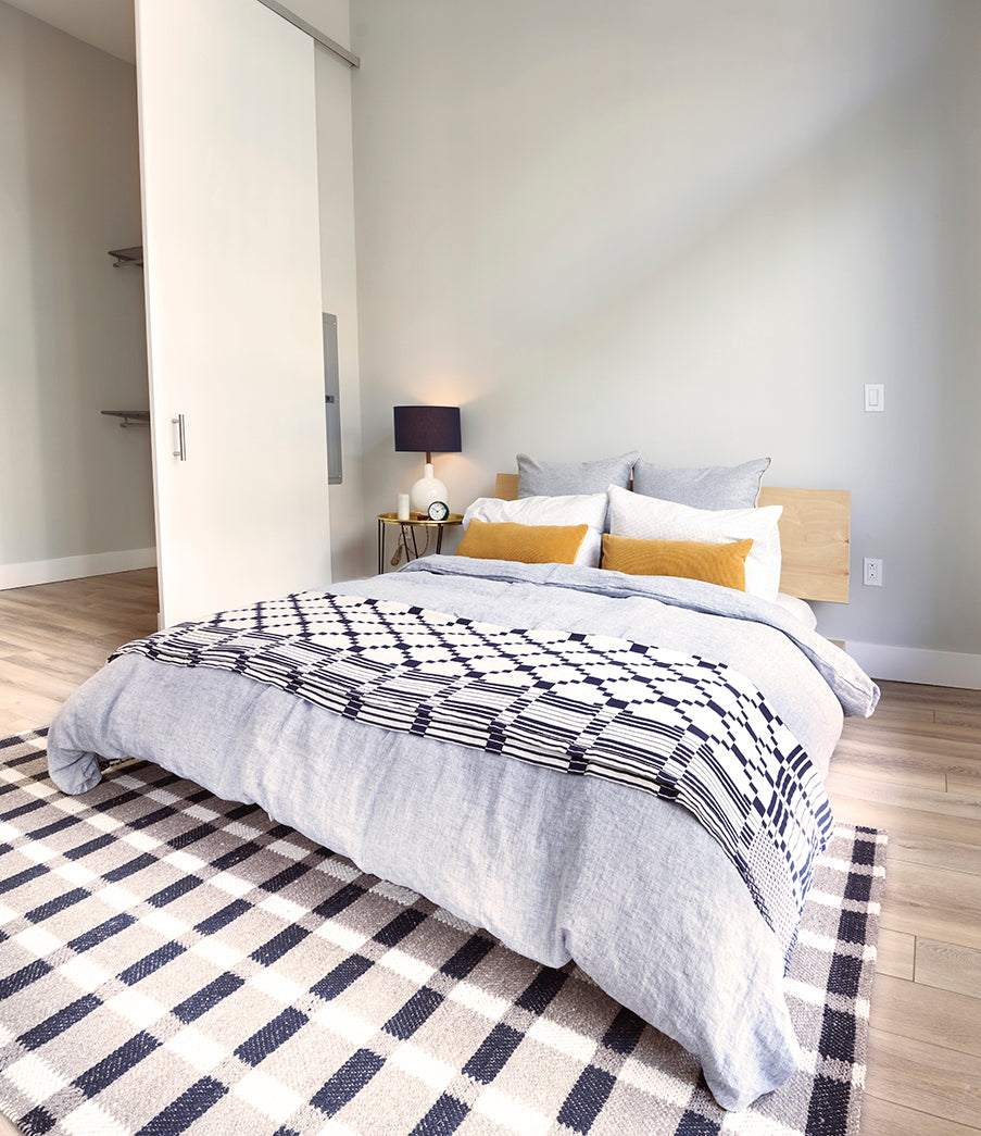
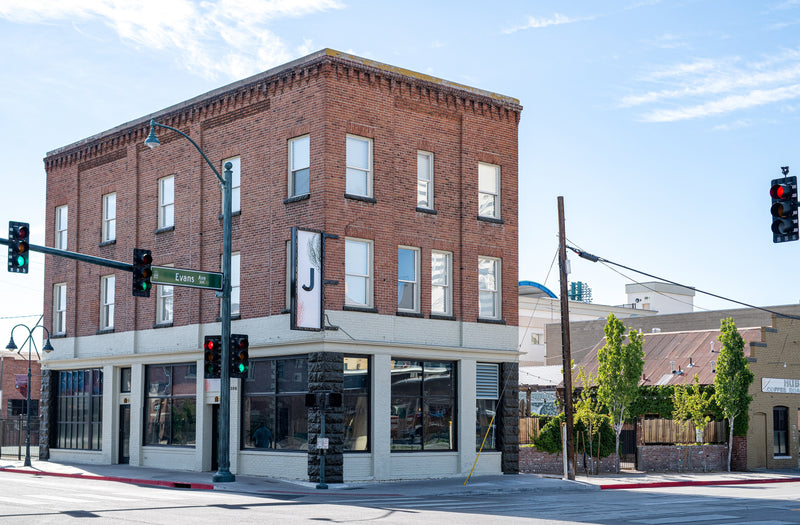
Lively and inspired, Prometheus Apartments' newest building The Dean is a luxury living complex in Mountain View, CA. Inspired by the concept of non-conformity, the name refers to renegades and party lovers like Dean Moriarty, Dean Martin, and James Dean from the 50s and 60s. To bring the concept and vision to life, "The Dean" brought in Schoolhouse stylist Jess Ford to outfit a special unit using some of our favorite design icons. We caught up with Melissa Cruz, Prometheus' Director of Interior Architectural Projects to learn more about the inspiration of the space and spoke to Jess about her design process.

Tell us about the Dean! Is there a story behind the name?
Melissa Cruz: The name is a collaboration between Prometheus and Marie Fisher Interior Design (MFID) with “The Dean” referring to renegades and party-lovers from the 50s/60s era. Dean Moriarty, from Jack Kerouac “On the Road” fame; Dean Martin, the singer/actor who inspired a Palm Springs-like fun loving background; and of course the granddaddy of all Deans – James Dean who died tragically young, but is the forever icon of cool and hip. The basic concept of The Dean is non-conformist. During James Dean’s era, everyone followed group norms. American society was almost entirely based on conformity. James represented freedom from it, and that is what we hoped to recreate with The Dean.
Why did you choose Schoolhouse for this project? What shared values do you see between Schoolhouse and Prometheus?
MC: Schoolhouse’s core belief is that a home should be designed with people in mind and that every detail matters. Prometheus holds the same core values, and we center our designs to be purposeful and create meaningful and thoughtful spaces. We share in the belief that design is timeless and iconic. There is a story behind everything we do, and we look beyond beautiful spaces and elements to make our designs intentional as well as functional.
Schoolhouse products are high quality, and they don’t get caught up in trends. They're timeless and Iconic, just like The Dean. I feel like most Schoolhouse products can work with our overall sense of style. The simplicity of design and materials used are very much in line with our brand.
What were some of the highlights and/or challenges of working on this project?
MC: One highlight is the art program that was commissioned by PRG and coordinated by MFID design team. This was a challenge since we had to coordinate with several artists, but the body of work that was created was well worth it. The original idea was to create a connection with Mountain View as well as keep in line with the concept of the interiors. Working with the CEO, MFID developed an idea to create works inspired by iconic landmarks of Mountain View. The design team set out to find artists that could create original works inspired by photographs of Mountain View landmarks from the 50s and 60s. The result is work that is visually stimulating and relevant as well as complementary to the interior design.

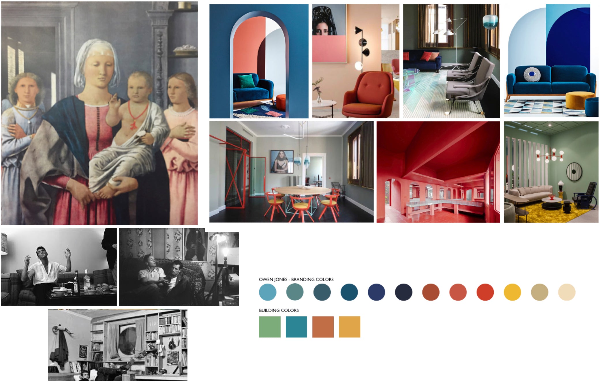
Jess' inspiration for the space
Another highlight is the color blocking that was carried out through the interior architecture and furnishings. It took an immense amount of coordination since certain spaces needed all fixtures, finishes and furniture to be the same color, and to add more complexity, each building is a different color which is expressed by the restrooms, mail rooms and elevator lobbies. It also serves as a way-finding device throughout the entire complex. Again, the result is interesting and playful and the colors are bold.
What did the design process look like from inspiration to execution?
Jess Ford: The design process started with Prometheus providing me with all of the different plans, concept layouts and interior style inspiration for the entire building of The Dean. I was super drawn to the NorCal raw vs. refined aesthetic and their use of color. From there I determined how we can best incorporate our Schoolhouse vibe and came up with a few different proposals. Working with Prometheus is really lovely because they give me freedom to interpret the inspiration, and then we work together fluidly to land on a final design for the unit. I was able to go down to the Bay Area to execute the styling and installation, and it was exciting to see all of the planning come to life and even change some things in the final stage.

What were some of the highlights and/or challenges of working on this project?
JF: The key was adaptability and staying inspired. Our deadline was a moving target, so a big thanks goes out to the teams behind the scenes like supply planning and shipping to ensure that the vision was achieved from start to finish. You can do all of the planning in world, but until you get in the unit you’ll never know how things are going to land. So I would say the highlights are also the challenges because you have to choose items that can move around a space and work anywhere.
Any future projects on the horizon that you’d like to share?
JF: We are currently working on a Mini Creative Suites styling project for a few different locations. It is really cool to see how Prometheus and Schoolhouse can mirror each other aesthetically and tell the same story in our own ways. This project is unique in that we’re highlighting similar style points from a bunch of different locations and have narrowed them down to three different options. It’s fun to see how different each option is while still reading as Schoolhouse.
