Inside the Home of Our Spring '24 Catalog

Last month, the Schoolhouse Team ventured to a contemporary California home to photograph our Spring '24 Collection. To paint a picture: imagine stacks of boxes, the bustle of bubble wrap, and lots of laughter. The connection we feel to our products, each other, and the home we photograph is why we make the effort to capture our products in real, lived-in spaces.
As we celebrate the launch of our Spring Collection and upcoming catalog, we wanted to share a slice of what goes on behind the scenes. Scroll below for a glimpse into a Schoolhouse photoshoot and a few design tips from our talented stylist on set, Martin Bourne.

This season we're leaning into the soft shapes, strong lines, and bold colors of California casual and seventies-inspired designs. To help shape a visual story, we asked interior expert and Schoolhouse friend, Martin Bourne, to be our stylist on set.
Our Spring Catalog is centered around California casual + 1970s-inspired interiors. How did you infuse these themes on set?
The main point here is that you need to understand what those interiors looked like in order to pull together the pieces that will complement that aesthetic. In this specific space, we wanted to pay homage to the cool, casual energy of the 1970s. To that point, we chose ceramic over glass, organic over machine-made, soft over rigid in the materials and products we celebrated.

"I live for and love the imperfect—that little thing that draws your eye in a space that’s at once out of place, a little off, crooked, too close together, the repair, the handmade, that’s what separates catalog from composition."


Could you walk us through your creative process when it comes to interior design?
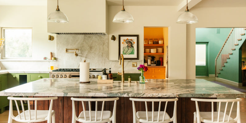
Whether you're styling a photoshoot or working within the walls of your own home, it’s important to sit for a minute and think. How do I use this kitchen? This dining space? What is my time here about? Is my kitchen a place where I want to spend a lot of time? To read? To think? Is it my workshop to cook in? Or more of a blank slate to keep clean and tidy?
It’s the same on set. I always start by asking how a space functions before I start designing. For example, are you a formal dining room family or do you eat around the kitchen island? Invest in pieces that make sense for your unique way of living.
Design Tip: Let function inform the final design. Make a list of all the daily activities that might happen in a room and build your interior around it.

"I always start by asking how a space functions before I start designing. It's important to sit for a minute and think. How do I use this kitchen, this dining space. What is my time here about?"

We often quip, the mix beats the match. How does this styling philosophy play out in reality?
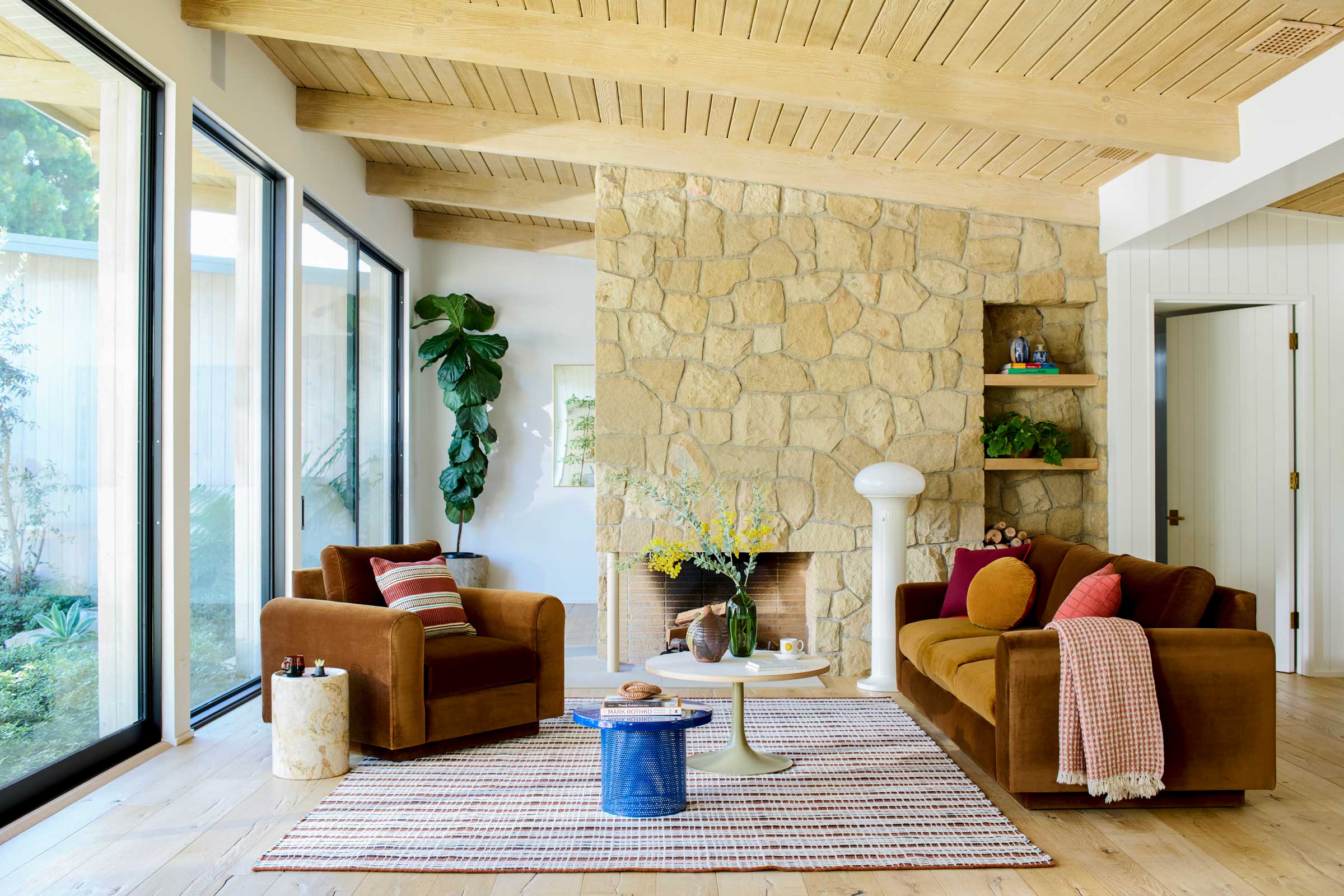
Particularly with the pieces from Schoolhouse, the mix is an important element. It’s too easy and also a bit stifling to live with everything being the same style, the same color palette with monolithic materials. This home already leaned heavily into its past: the field stone fireplace, the planked ceilings, the stucco exterior.
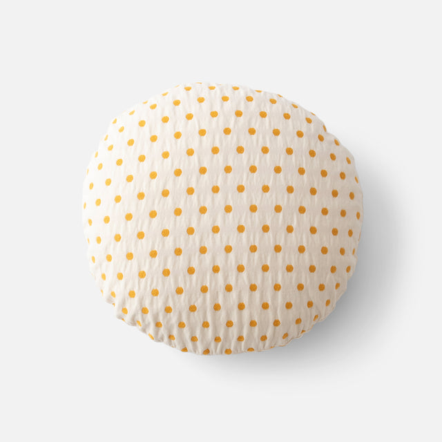
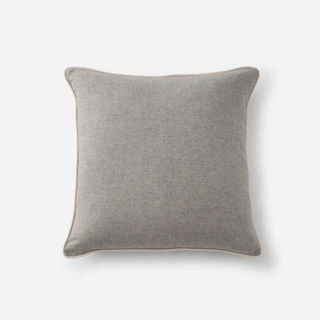
To balance the clean, pared back living room aesthetic, we layered in warm textures in a rich color palette. We selected velvet pillows in fun color pops to add an unexpected and joyous element. The sleek silhouette of the sofa and lounge chair also added visual variety and a little more "carte blanche" energy.
Design Tip: Ask yourself what the primary style or feel is in a space and balance it out with an opposite, unexpected element. For example, if you have a lot of sculptural furniture, mix in linear lighting.


What were some of the highlights and/or challenges from the photoshoot?
It’s always fun to have the faith and trust from your creative team to play within. We all loved the idea of bringing the outdoors in, so we leaned into it in our styling.
When we explored a story around powder coated metals, it made perfect sense to create a landscape of these pieces tucked between and behind the Agave plants and trees around the house. The contrast of the matte vegetation and natural materials made for the perfect shot.


When it comes to interior styling, how much of the work is planned versus adjusted on set?
I wanted to be a bit casual here and say that nothing can be planned, but there's always a sense of wanting to have the right ingredients with you—some props you may use, and some may ultimately not be the right fit for a room. Whether it's a collection of quirky California studio ceramics or an overgrown plant that's one new leaf away from tipping over, it’s all about the story that comes together once you physically walk through the space.
Design Tip: Embrace imperfection and incorporate it into your styling. Think overgrown florals, handmade ceramics, or thrifted finds that show age and use.


Last but not least, if you had to choose one design philosophy, quote, or story that has stuck with you through the years, what would it be?
I live for and love the imperfect—that little thing that draws your eye in a space that’s at once out of place, a little off, crooked, too close together, the repair, the handmade, that’s what separates catalog from composition.


