Our Guide to Mixing and Matching Colors Like the Pros

Your home is your canvas, so why not decorate it with vibrant, eye-catching hues? Mixing and matching bold colors is a foolproof way to add personality to any space – and the possibilities are endless. However, there are a few things to keep in mind so you don't overwhelm your home with a rainbow of hues.
Whether you're a color enthusiast or simply looking to step out of your comfort zone, we'll teach you how to mix and match bold statement colors just like the pros, while also recommending a few of our favorite color-forward pairings.


1. Start Small
If you're new to bold colors, start small. The easiest way to begin incorporating pops of color into your home is through accessories like throw pillows, rugs, or artwork. This way, you can experiment with different combinations without completely overhauling your space.


2. Balance Is Key
When mixing and matching bold colors, balance is key. Pair a bold color with something more on the neutral side to create a harmonious look. For example, if you opt for a statement sofa, like the Milo Sectional in Poppy Velvet, you might want to balance it out with neutral-colored walls and lighting. On the other hand, if you're the type that likes to go bold with your wall colors, opt for accents in softer, more neutral hues to help balance out the room.


3. Let Your Colors Shine
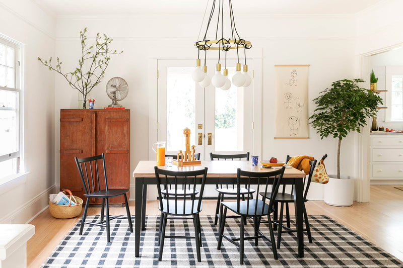
Don't be afraid to let your chosen colors shine. Avoid overcrowding your space with too many patterns or competing colors. Instead, let the bold colors take center stage by keeping the rest of the decor simple and understated.


Now that you have a few basics down you might be wondering, how do I decide which colors to choose? Below, we share a few of our favorite duos and why these bold hues are made to be paired together.
Playful Palettes
When aiming for a cohesive and serene feel, we recommend exploring the world of analogous colors. These are the colors that share close proximity on the color wheel – think blue and purple, or yellow and orange. By merging these shades within your home, you effortlessly infuse your space with a sense of tranquility and cohesion, allowing each hue to complement the other. Through the use of bright yellows, calming reds, and earthy browns, the bedroom below achieves a sense of comfort and ease.

Daring Duos
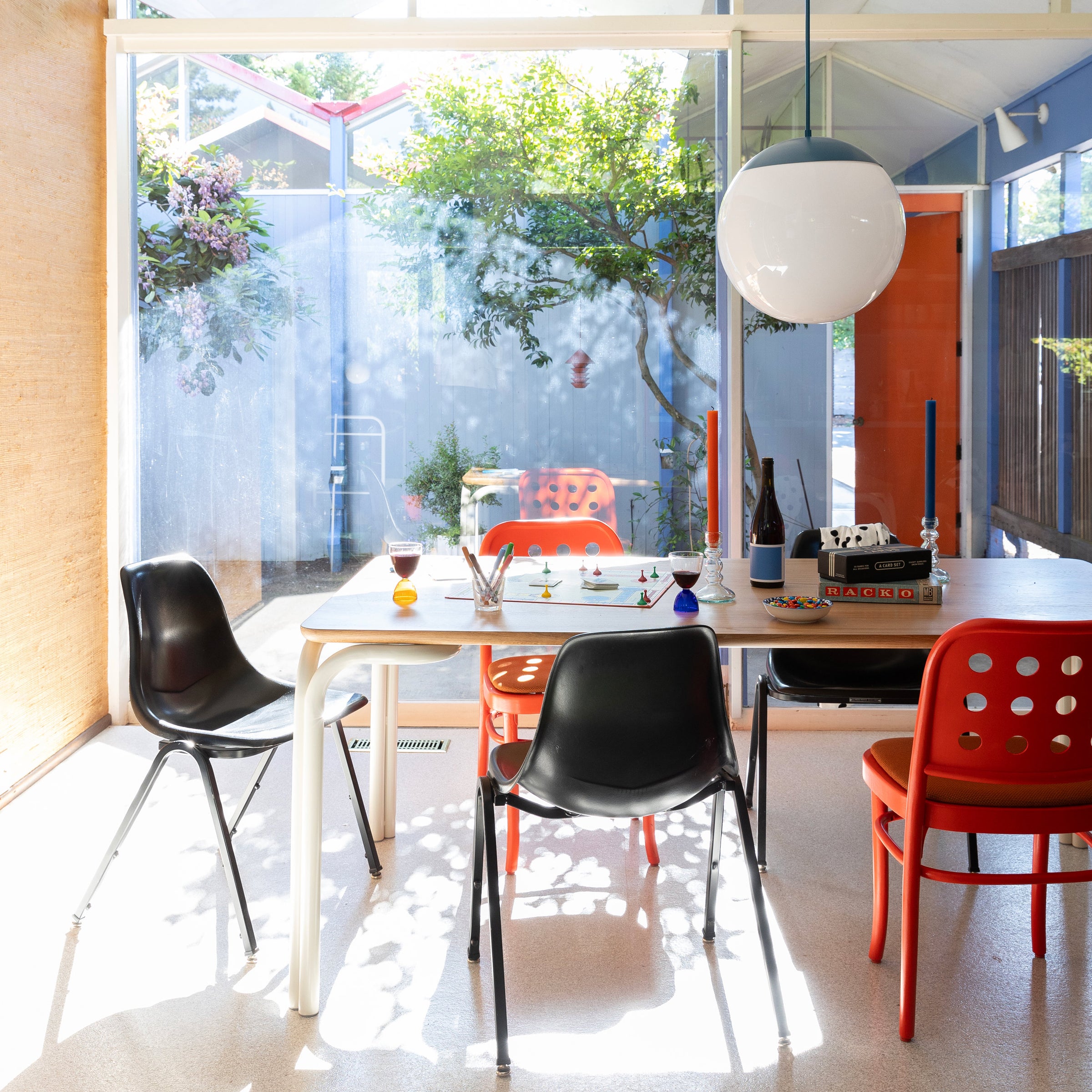
For those who want to add a touch of excitement to their color scheme, consider using split complementary colors. Instead of pairing a color with its direct complement, choose the two colors on either side of the complement. For example, if you have a bold red sofa, accent it with a splash of blue or green in the form of throw pillows or blankets.

Bold Statements
If you're feeling adventurous and want to create a vibrant and energetic space, triadic colors are the way to go. Triadic colors are evenly spaced around the color wheel, such as red, yellow, and blue. When used together, they create a bold and balanced look that is sure to make a statement. We love the use of our Ray Pendant in Bellini paired with shades of deep blue and sunshine yellow in this dining nook.


