Step Inside Our Visual Manager’s Reimagined Ranch-Style Home

This is a love story, really. When Anna, Jason, and their sweet pup Tucker moved into their 1970s ranch-style home, they walked in knowing it would require many weekend projects to transform it into a space that worked. Although the three-bedroom house looked classic from the outside, inside, it was an overwhelming mix of outdated styles and materials.
With a clear creative eye and self-taught carpentry skills, the duo was able to turn their bygone abode into a modern and minimal retreat. Now, six years later, every inch of the space thoughtfully balances function and form with unexpected touches that perfectly highlight their passions and lifestyle (design, coffee, sneakers, and the KC Chiefs, among other things!). Whether you're a fan of modern design or simply appreciate a good before-and-after story, this dreamy dwelling is sure to inspire.
Below, we chat with our Visual Production Manager, Anna, to hear more about the laborious process and oh-so rewarding end result.

Tell us about your home. How long have you lived here and how did you know this home was the one for your family?
We’ve been in this home going on six years. The market wasn’t as crazy as it is now, but we still had to see the diamond in the rough that was this home after many offers fell through. We were looking for a place that was close to Portland and had a fenced-in yard—this place checked both those boxes!
We also liked a couple of little design details, like the peaked roof over the primary bedroom and the covered patio in the backyard. No matter what house we landed on, we knew we would end up turning it into a project to make it exactly how we wanted.
Before:

After:

Could you tell us a little bit about your background and current role at Schoolhouse?
This July will mark five years of Schoolhouse! By then, I will have split my time here between my initial role as a Warehouse Lead and currently as the Visual Production Manager, where my background in photography and general interest in design and home goods perfectly intersect.
How long did it take to renovate your home?
The first 80% took about a year, and the last 20% has been ongoing for the past two or so years (with just a couple more projects on the horizon).
Before:

After:

What were some of the first home projects you tackled? Could you walk us through some of the updates?
The first project we tackled was building out the garage to support what we knew would be a lot of DIY home projects. Jason built a workbench and drawers so all his tools would have a place.
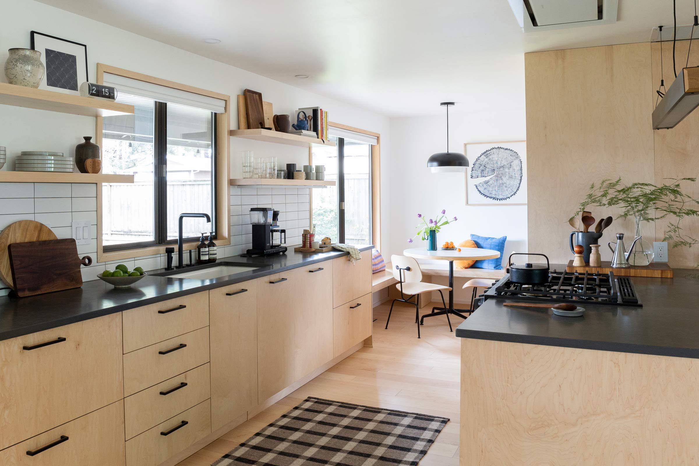
We knew pretty quickly that we would want to knock down walls between the living and dining rooms. From there, the major renovations started unfolding—carpet came up, all interior walls and ceilings were skim coated, hardwood floors went down, and an entirely new kitchen buildout took place (this included all new cabinets and shelving, all of which were built out in our garage by Jason).
We also decided to turn our two guest rooms into a single room that would become the studio and work-from-home office, which became necessary in 2020.

Has your style changed since working at Schoolhouse?
I feel like my style has changed due to time, geographical location, and living with another person. I used to have a strong affinity for antique stores and all things…old. Now I’ve grown to appreciate clean and modern conveniences. That said, I will always be drawn to well-made objects that evoke an heirloom feel. My career at Schoolhouse has perfectly bridged that gap for me.
"I will always be drawn to well-made objects that evoke an heirloom feel. My career at Schoolhouse has perfectly bridged that gap for me."

Do you have any design philosophies you live by?
Our design philosophy: not being fussy or overly stylized + using materials that are easy to work with.
For us, it meant consistency in using maple and dark stone throughout our space and building a clean backdrop for key fixtures, appliances, and objects.
To you, what makes a house a home?
When I come home I want to feel comfortable, safe, and inspired. When everything has a place to land, it's easy to keep organized and enjoy our home without feeling cluttered.
We like to be intentional about what we bring into our home and only fill our shelves and walls with items that bring us joy, right down to our serveware and coffee pot. Of course, most importantly, what makes a home is wherever Tucker finds a place to curl up and cuddle, which for the record, is just about anywhere.


If you had to pick three words to describe your interior aesthetic, what would they be?
Functional: prioritizing how we want to use the space to avoid dead space that doesn't get used. Lots of drawer space, flat surfaces for objects, and open living space.
Restrained: not trying to be too precious or overly ornate. Flat surfaces, straight lines, and simple plywood—details that allow the items we bring into the space to stand out.
Personal: we admire spaces that are a reflection of the people that occupy the space. We do that through the items we choose to display: design books, art prints, memorabilia, and outtakes from college ceramics classes.
Before:

After:

Given that you’re a Visual Manager and Jason is a Designer… how did you and Jason go about designing the space with both of your styles/perspectives in mind?
Fortunately, our design aesthetics are pretty much in sync. We tend to need more of a planned-out visual of a space, which is why we leaned heavily on 3D and technical drawings that Jason was able to create.
Doing that helped us feel confident about how a project would come together before picking up a tool or making a lumber yard run. We also decided early on that while we don’t know how long we will be living here, we aren’t renovating for house value. We're doing it for ourselves in this season of our lives and aren’t letting resale factors determine any design decisions.
“We decided early on that we didn’t want to let resale factors determine any design decisions. We wanted to renovate for ourselves in this season of our lives.”


Were there any design must-haves for either of you in your home?
We knew we wanted to balance organizational space and storage while creating room for all the items that bring us joy. Creating an environment where we could have them out was key, so providing a lot of open shelving was top of mind. Light was also a big factor. Almost all of our light sources throughout the home is dimmable and never cranked to 100%.
Tell us more about the Murphy bed please! What prompted the idea and how did you build it?
Since we don’t live near family, we anticipated needing room to host visitors. We wanted to prioritize having a working studio area, but also wanted our guests to have a dedicated and thoughtful space when they came to town.
The Murphy bed was the perfect solution. We bought a hardware kit online and added the built-in drawers and shelving on either side. When not in use, there's space for a loveseat and a coffee table which creates room for both of us to be working in the studio at the same time.

What have been some of your best memories in this home? Do you have a favorite room in the house to spend time in?
We are really proud of the home we’ve made together, so any time spent here is cherished. We also very much enjoy hosting friends and family. The first couple of summers before the interior was renovated, we spent a lot of time hosting outdoor BBQs in the backyard.
The kitchen is my favorite part of the house—it’s where I can cook and clean while also keeping an eye on whatever Kansas sports team happens to be on tv. Go Chiefs!

Last but not least, if you had to pick one all-time Schoolhouse favorite, what would it be?
I would have to go with the product we bought two of—the Penn Chandelier. The Penn doesn’t feel overly decorative. I appreciate that it's restrained in presentation, but its scale makes it a statement piece. It's the perfect compliment to our overall style. A close second, would be the Teig Table Lamp, which sits on our dining room shelf (that dimmer switch is a real thing of beauty).
Before:

After:


