Before & After: A 100-Year-Old Kitchen Gets a Fresh Look

When it comes to interiors, there’s nothing as satisfying as a dramatic before and after. Recently, Schoolhouse friend (and Food52's VP of Creative), Elizabeth Spiridakis Olson, renovated her kitchen, and we couldn’t be more inspired by the transformation. By working smart and going with her creative instincts, Elizabeth leveraged the existing footprint of her 100-year-old home (yes, you read that right) to create a bright and beautiful landscape filled with pattern and color. Scroll below for some fun kitchen ideas and the inside scoop on the laborious but oh-so-rewarding end result.
Tell us a little bit about your home. How did you find it, and how long have you lived there?
We bought this house in 2016. We were living in San Francisco and really wanted to get back to the east coast! It was not the easiest way to hunt for a house. I was on maternity leave, looking at listings online (sending my dad and sister to see a few for us to vet). We made one trip out to see a couple of houses, and this one had a lot of what we wanted: character (it’s 100 years old, which is both good and bad), a gorgeous neighborhood, enough room for family to stay, hvac, and new windows.
The alternative, not-so-practical answer is that we have a quirky closet built into our stair landing. It’s lined in a striped wallpaper that's definitely from the 70s and has a funny little light fixture. When I opened the closet, I knew this was our house.
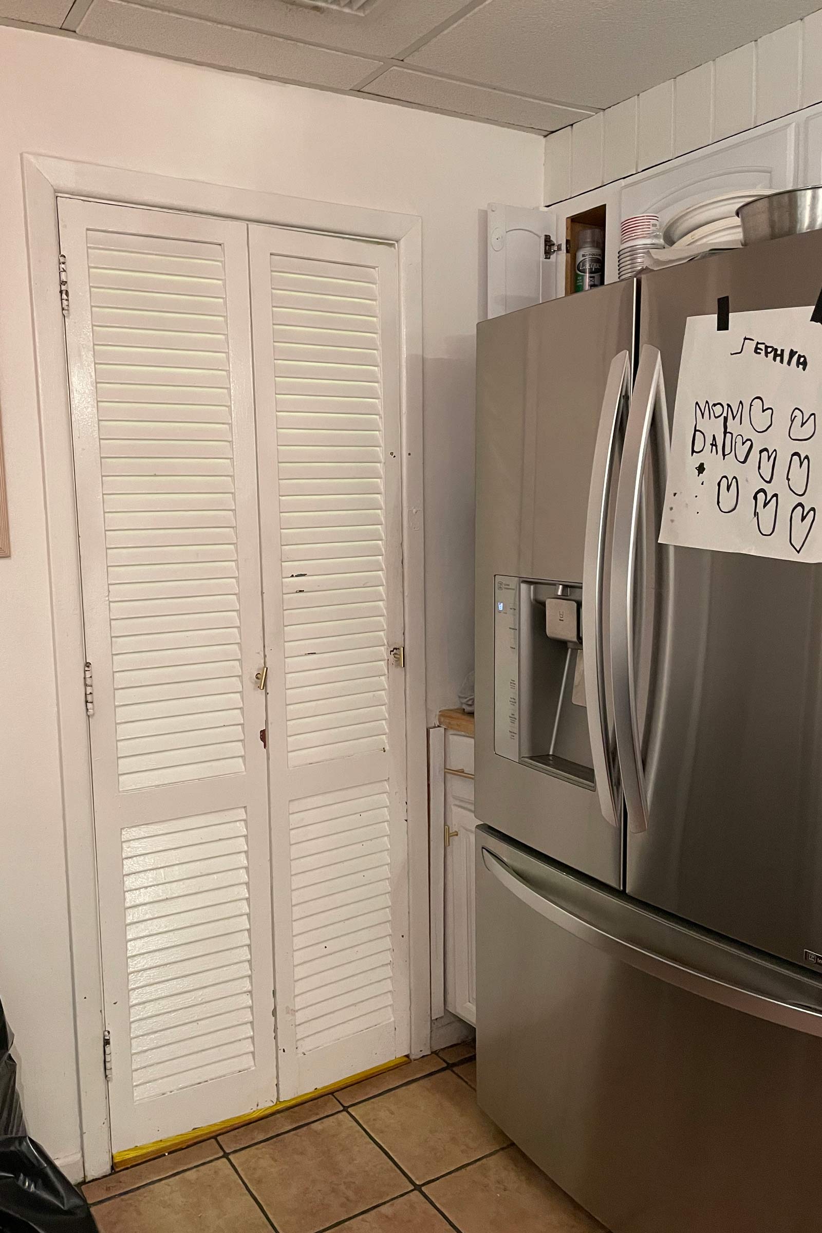
Before:

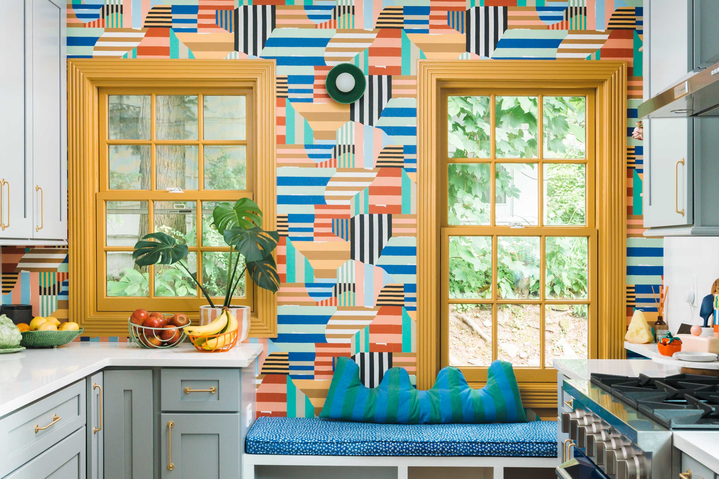
After:

If you had to choose three themes that inspired your kitchen design, what would they be?
Color: Obviously. It is so important to me. Color brings me joy, full stop. I didn’t want to go overboard, I just wanted to feel good in the space.
Making the most of what we have: This reno was for the kitchen, a powder room, and the back hall + door that leads to our yard. Our budget for this project was not huge, but I thrive in these environments, and I love to problem solve. I had also been living in this space for six years and knew every inch and how best to make it flow!
Functionality + ease: I spend so much time here. I wanted it to be enjoyable, not a slog. My goal was to connect the dining room to the kitchen (by adding the arch), so that we had enough space to be together when cooking or eating meals.
“The soul of the space is color and chaos mixed with personal storytelling.”


How long did it take to renovate?
Just under four months. The end took the longest (waiting a week to finish the wallpaper because the bathroom window wasn't here, etc.).
Could you walk us through some of your kitchen updates?
We went to the studs for all of it, and there was nothing to salvage because it was all so old. Living in a 100-year-old house, I was terrified of what would be found in our walls once the demo was done. We were so nervous, but it was not as bad as we thought!
We did discover a structural beam that we hadn’t expected, but we didn’t want to add to the budget to remove it, so we worked with it. The beam caused some asymmetry in the cabinet sizes around the stove, but this house is full of imperfection. My husband felt it would be a great addition, and he was right. I love the beam — having that touch of warm wood that matches the flooring feels so right and gives the space character.
Another addition was the arch. It wasn’t entirely part of the plan, and I kept waffling on it. I wasn’t sure if it would feel odd in our old colonial and if the jut of the little peninsula would feel strange, but I couldn’t get it out of my head, so we went for it. Now, it’s one of my favorite details of the space.
Before:
After:

What did your creative process look like?
I approached the kitchen the way I do any other creative project. I started by saving a ton of inspiration on Instagram and Pinterest. Then, I made a deck of every room and added images of what I wanted. I let budget and ease of availability determine many things (I had dreamt of really wild marble everywhere, but my budget was like, sorry, try again).
I pretty quickly honed in on my palette: navy (my stove), red-orange (a pendant light over the sink), and mustard (painted trim). Once I had my highlight colors, I started building things around it. The cool-gray cabinets, white counters, brass pulls, and warm wood tones felt like natural complements and tied in with the rest of our house nicely.
Before:

After:

Any tips (or cautionary tales) to share for those attempting their own renovation?
I don’t think any of these are novel, but here's what I learned:
1. Order everything as soon as you possibly can, and if you can renovate in the summer, do it. We had a very cold winter INSIDE the house.
2. Compostable cups, plates, and utensils are lifesavers (so are neighbors who are kind enough to let you use their dishwasher).
3. Even with a decently positive experience (which ours was), your life and house will be turned upside down. If you are like me, living in a horrible mess can make you slowly go insane. But, much like the early newborn haze of motherhood, I have forgotten all of it, and I love my house a lot more now.
Last but not least, what is your favorite part of the finished design?
There are so many things! The view of the wallpaper from the fridge. The bright green pocket door below the butterscotch clock (love having an analog clock). A tiny beverage fridge we added across from the powder room for wine, seltzer, and tiny cans of diet coke. The bench! The arch! The green wall sconce! A giant drawer for all of my utensils. A pantry cabinet with pullout drawers. The pegboard that houses some vintage items I love and have had for 20+ years. Too many things to name.

Photography by Thomas Leonczik


