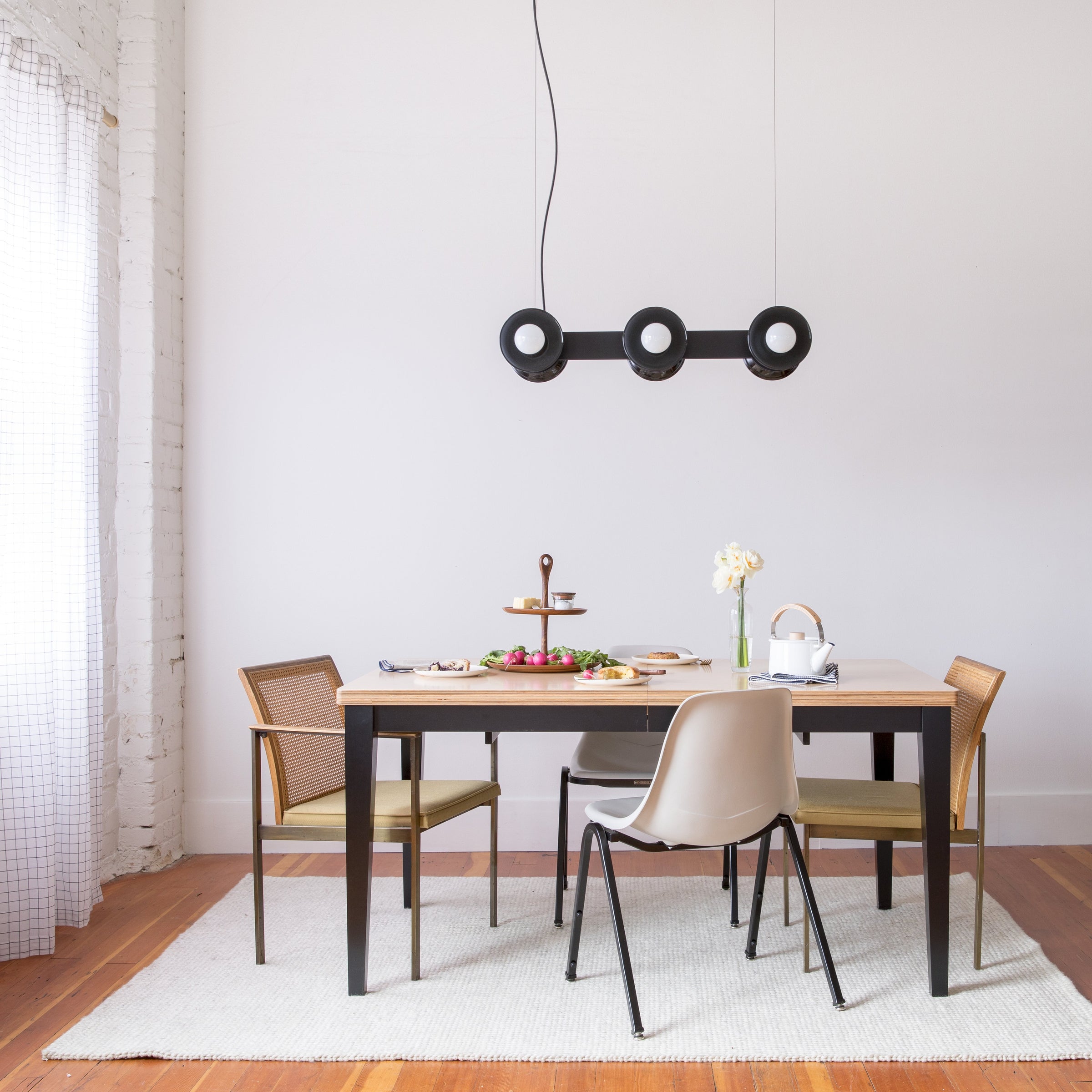
The Regent Collection

It took a small, routine decision for the Regent Collection, our newest line of chandeliers and pendants, to really come together in its final form. The design team had already decided on the basic silhouette of the piece, and they had built a full-scale mock up to show Schoolhouse founder and Creative Director Brian Faherty. The main difference between the model and the real product was that the designers had used wooden spacers as a placeholder in a section where they intended to use brass.
But seeing this arrangement, Brian pointed out that it was better than what was originally intended. The team agreed and changed the spacer from solid brass to oak veneer, which is what’s used today.


The decision to include the oak spacer is arguably one of the most important decisions made in the development of the light. According to Creative Manager Jorie Garcia, “I think the most interesting thing about the Regent is the interplay in materials. The wood, the ceramic, the brass, the exposed wiring.” While the overall silhouette of the piece is what catches the eye, it’s this nuanced relationship between its components that demonstrates its real complexity.
To get to the point where this decision was even relevant required more than 18 months of hard work, including concept development, sketches, 3D renderings, models, mock-ups, and prototypes.

The designers had set out on the project with a few goals in mind. First, they wanted to create something with a linear profile to complement the other chandelier offerings in the product line, all of which previously had been to be designed in the round. Second, they wanted to find a way to incorporate the Alabax sconce, one of the most iconic and enduring pieces Schoolhouse makes. Finally, inspired by a recent trip to Pittsburgh, Brian had some of their local buildings on the mind. The historic Regent Theater, built in 1914 as a silent movie house, contributed two concepts: the idea of theater marquee lighting, and, of course, the chandelier’s name.

One of the original concept designs featured an elaborate structure of tubing which was meant to lend a more sculptural presence and hide its electrical cord as well. However, when it was mocked up, Product Development Lead Katie Elliott felt the arrangement was too busy for the Schoolhouse aesthetic. She went back to the drawing board to find ways to simplify and streamline.
Eventually the team settled on a version of the current, more direct design. Katie and New Product Engineer Brandt Clawson began to create small models to get a sense for how the design would feel in space. Brandt started by 3D printing scale replicas of the medium Alabax. These were conjoined with pieces of foam board and wiring to get a more complete vision for how the parts would relate to each other.

Once the basic silhouette was established, they started to refine the small but important details. Finding the perfect thickness for the brass plates was crucial to making the fixture feel substantial but refined. The natural drape of the nylon-wrapped power cord lent a needed air of informality to break through some of the more structured features. And of course, the addition of oak brought it all together, creating a sort of material study within a larger concept and form.

The final steps involved sourcing quality vendors for what parts couldn’t be made in-house. The Alabax fixtures are made at a local ceramic studio, and the majority of the other components come from the United States. The canopies are the thinnest canopy used by Schoolhouse to date, a specialty product from a trusted manufacturer in Canada. The entire product is finished and assembled here in the Portland Schoolhouse factory.


Often, arriving at a finished product is more about the dozens of small, seemingly unimportant decisions along the way than a lightning bolt of inspiration.

