Inside the Design: Max Humphrey x Union Wine

Is there anything better than when two of your mutual friends get together? That’s the question we were asking ourselves here at Schoolhouse after seeing the office space Max Humphrey created for Union Wine Company.
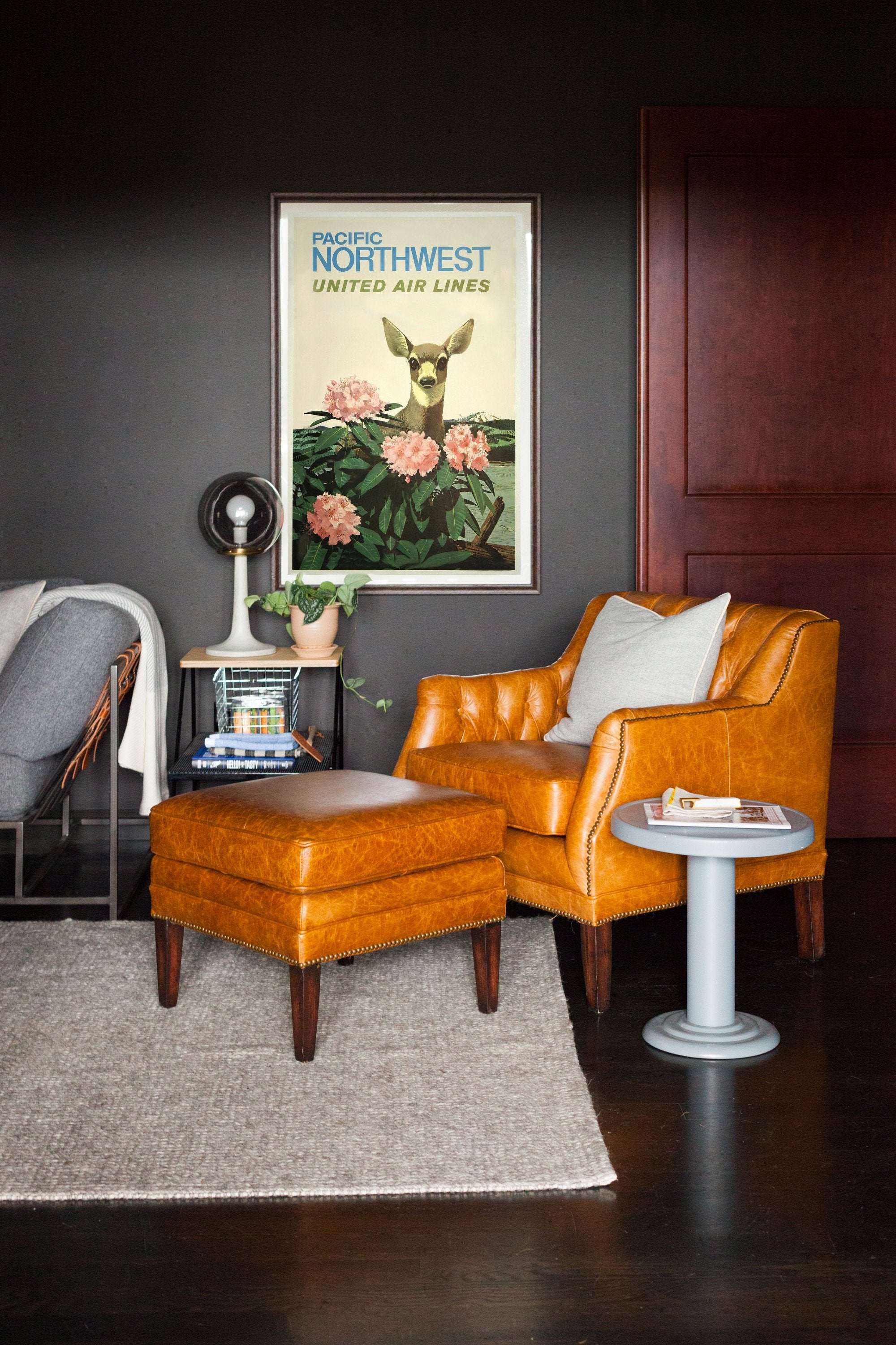
If you’re not already familiar, Union Wine is known for their unpretentious and delicious wines packaged in picnic-portable aluminum cans. This brilliant libation innovation (which they’ve been generous enough to supply at many of our parties and events over the years) landed them on Fast Company’s “World’s Most Innovative Companies” list this year and has earned them some much-deserved commercial success to boot. Max you might remember from our past Design Spotlight feature or from appearances in publications like Architectural Digest, Better Homes & Gardens, and Dwell. The office Max designed combines rich tones and materials, vintage and modern heirloom pieces, and a few playful touches to create the ideal workspace for envisioning the spirits of the future.
How did the Union Wine project come about? Was it a new space, a renovation, a redecoration?
"Kyna over at Union Wine had asked Schoolhouse’s own Summer Wick if she knew any designers to help out at their offices and Summer recommended me. I added furniture, art, rugs, and accessories to their already super cool space."
How long did it take to complete the project? Were there any noteworthy challenges or difficult decisions to make along the way?
"It’s been almost a year since I was first introduced to the Union peeps. Ryan and the crew weren’t looking for ‘fast food-style’ design so we’ve taken our time picking out pieces that really mean something to them. And it’s not finished—a good design project never really ends. As cool as it is to take lots of time decorating, the long-term nature has also been a challenge. This is a working office full of people that need to have some sense of a functional space."

What’s your favorite part about the finished project?
"My favorite part about the offices are how dark they are. There’s a big trend in design right now where everything with so white and bright so the fact that the walls AND ceilings are painted dark gray (which they did without me!) just goes to show how non-traditional Union is as a company."
Did Ryan Harms (Owner of Union Wine) come in with a direction and strong preferences or was this more of a blank slate project?
"Ryan’s own office was pretty much a blank slate and he definitely has a strong personal aesthetic. Mostly we filled his office with stuff was either bought or manufactured (or both!) locally, which is something we share as a priority in design. And we both dig heritage pieces that have some history behind them so it’s been fun sourcing both new and vintage heirlooms."

Was there a mood or atmosphere you were trying to achieve with this room?
"The office building is a 1930s schoolhouse, so the mood or atmosphere was all about respecting the architecture, which is something I do with all of my projects regardless of whether they’re commercial or residential. There’s also a laid back and progressive vibe to the company itself that I wanted to channel with the furnishings. Overly formal or ‘office space-y’ wasn’t going to cut it."
How do you approach designing an office as opposed to, say, a living room in a client’s home?
"Most of my background is in residential design so I approach commercial projects with the same process and mostly the same aesthetic. That’s why the Union Wine spaces I designed and the pieces I sourced look like they could be picked up and put in a house or apartment. I don’t like being in traditional offices with cubicles and contract-grade plastic furnishings. I couldn’t design something like that if I tried."
The Union Wine office has some very playful elements like the Classroom Stacking Chair and what appears to be a spare car tire set right on the countertop. Talk about how you mix in these unexpected pieces into your design.
"I don’t overthink mixing unexpected pieces in with more traditional stuff. If I really have to try and come with ‘unexpected’ it looks forced. My only design rule is don’t be boring."


Photography by Ellie Lillstrom

